
Day 2: Making a Tech Brand from Scratch, but not so much as to lose My Mind
At 3 AM, I’m occupied with looking at fifty shades of red on my television. Even though my coffee has cooled off, I am still making adjustments to this gradient. My Web3 design challenge Day 2 saw me challenged myself to create a complete brand identity for an imaginary technology firm. The wallet modal that was released yesterday did not appear to be problematic. 🙃
The Inception of Nova Tech?
Have you ever been surprised by the unexpected prompting to come up with “Nova Tech” while cleaning your house?. The term “Nova” caught my attention because it embodied the perfect blend of space-age cool and start-up energy. It wasn’t taken, mainly because I made it up
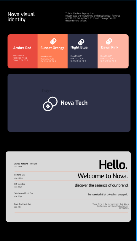
The Color Palette of Nova Tech Brand Itentidy is the same as thisThe primary color scheme is Ember Red (#E94A3F) - the RGB color is 233,74,63 and the CMYK color esteemed 0,68,73,9A minimalist geometric symbol is used to represent the sun's rising and forward momentum- Clean sans-serif wordmarkMaintain a clear area that is proportional to the height of the symbol around the logoThe minimum height requirement for digital images is 24px. 5 "for print ## Brand ElementsThe use of primary colors results in a blended effect- Floating geometric shapes- Micro-dot patterns for depthCorner cards with rounded edges (12px radius) are used- Semi-transparent overlays ## U IC omponentsHover animations are subtle when using action buttonsLightly drop shadows on cards to make them look cleanBrand colors as status indicatorsThe weight of navigation icons is 2px, which remains constantInput fields with a subtle inner glowPrimary: Axiforma- Headers: Bold- Subheaders: Medium- Body: RegularLight Italic is the preferred Style for editing photos- High contrast- Warm lighting- Shallow depth of fieldConcentrate on technology and human interaction## Voice & Tone - Realistic, natural moments- Progressive- Optimistic- Clear and direct- Professional yet approachable- Future-focused
Setting Today’s Challenge
Here’s what I had in mind for today (spoiler alert: I was overly optimistic):: Develop a logo that is unique and not associated with other tech startupsCreate a color scheme that emphasizes innovation without overstating” we’re striving too hard. “Choose between Web3 and human-responsive fontsDevelop UI elements that won’t make my designer peers uncomfortable
I estimated 6–8 hours. *Insert laugh track here*
Research Rabbit Hole
First stop: Pinterest. After two hours and about 40 tabs, I had enough moodboards to wallpaper my apartment. Did you realize there’s a psychology behind why tech companies opt for certain colors, or was it just me?
The Color Saga
My feelings towards Ember Red (#E94A3F) have been characterized by both love and hate. Today, we spent four hours together. FOU R. H OUR S. B ut take a glance at this beauty::
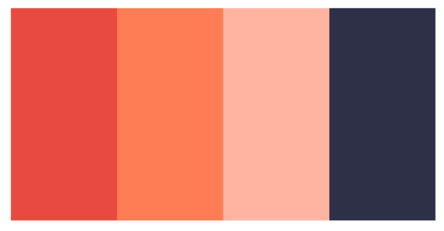
Nova Tech’s Color Palette
The Great Font Switch in 2025.
I have an entertaining story to tell: I was prepared with Axiforma. I had my type scale and components ready, and now I’m feeling pretty good about myself. At the sixth hour, I accessed Twitter and saw Exo in action on someone’s profile. Call out the complete overhaul at 11 P M. T here are moments when you simply know that there’s something wrong with you
1000 Ways to Reveal AL ogo: The Journey of 1000 Designs
Have you ever tried to create a logo that doesn’t look like something from an established template? I found it quite interesting. The concept of sunrise/forward momentum kept coming to mind for me, possibly because I was yearning for sunrise myself. Just kidding, I used a SVG lol that was randomly chosen and sent to me
The Reality Check
The final draft that I drew is available for viewing
What Actually Worked
Although I was slightly delirious, the UI elements were impressive: I’m a big fan of the gradient backgrounds, even though they took longer than expected to createIt took me an hour and a half to master the micro-dot patterns
Looking Ahead
Tomorrow, I will be exploring interactive prototypes. I need to get some rest for about 12 hours before trying to contact my family, who may believe that I am missing
What is your review of Nova Tech? Do you have any late-night design stories to share?. The response will be made public once I am back from my design marathon
Keep pushing pixels and remember that caffeine is a valuable friend for designers until tomorrow